Following a repackaging of Evernote's plan offerings in 2021, the Growth experiments team focused on testing new and different tactics that encouraged current paid customers to upgrade to a higher tier plan.
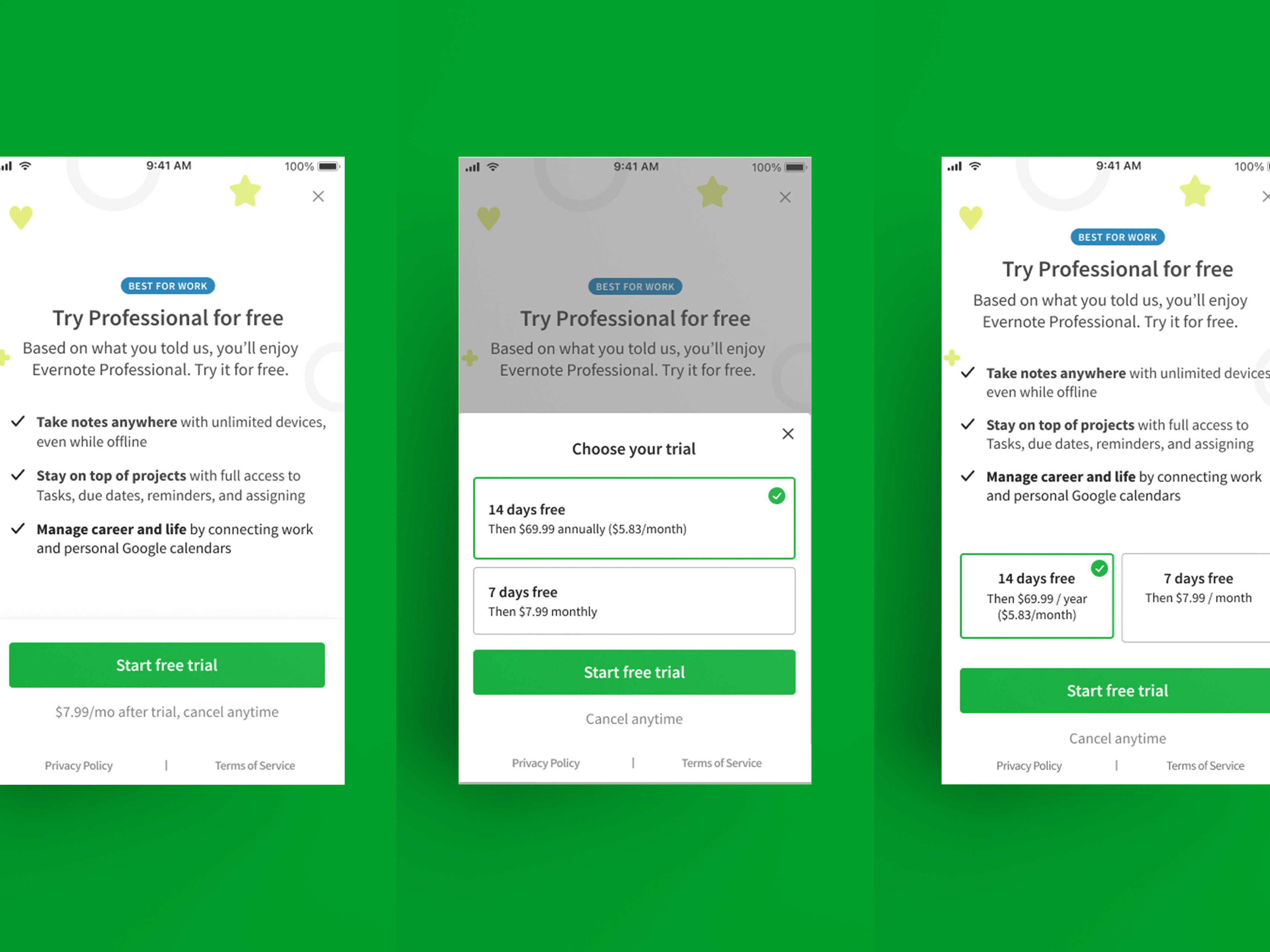
User feedback about our higher-priced Evernote Professional plan strongly focused around it offering "the best of Evernote" with a minimal price difference, so the team explored incorporating this message in a series of experiments across both mobile and web.
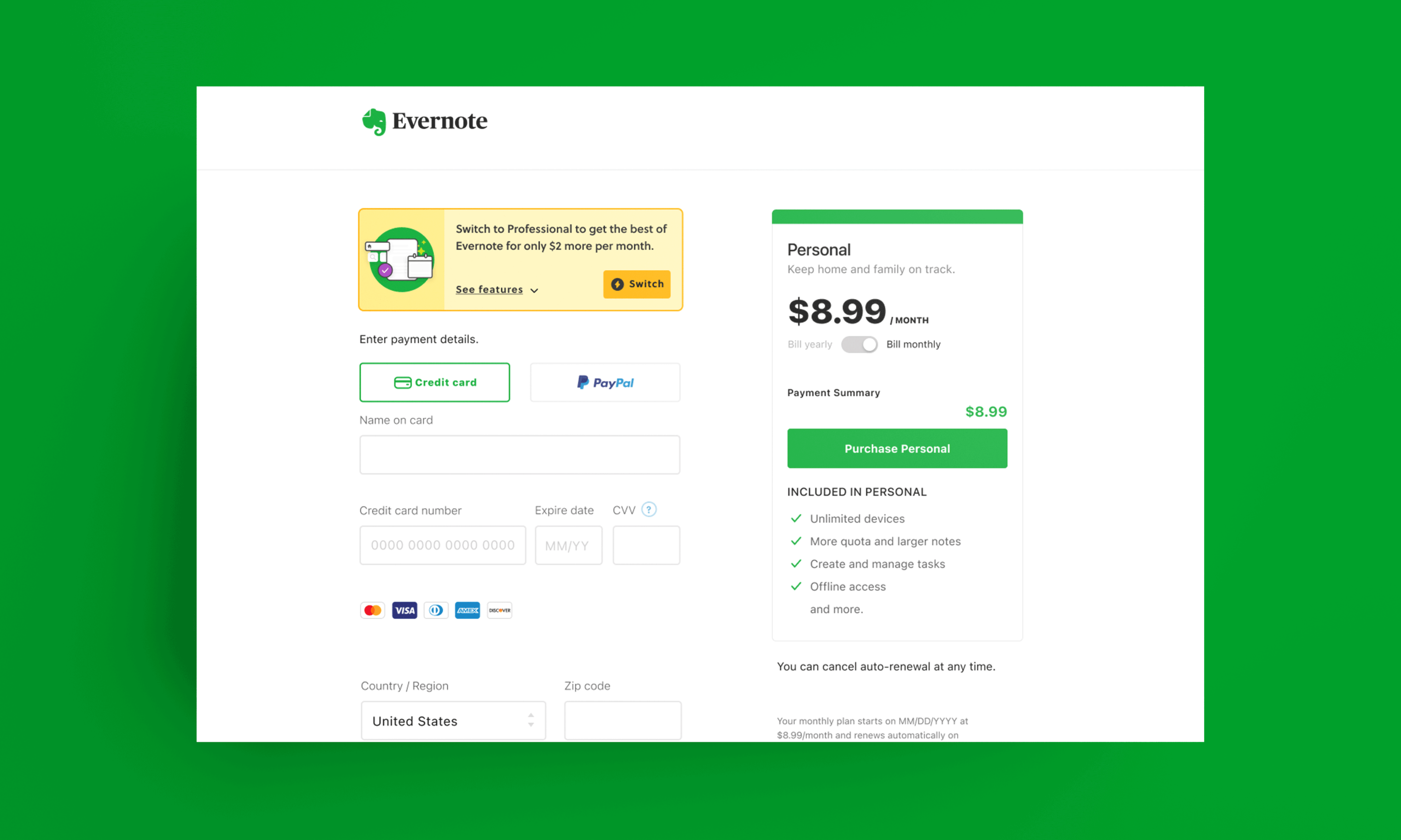
This experiment capitalized on the high-intent nature of users who land on our web checkout page by surfacing a small component with a focused list of value props that are exclusive to Evernote Professional.
Messaging was intended to maintain clarity by using "Switch" instead of "Upgrade" or "Choose" after these users have already chosen a plan at the prior step. This experiment's interaction design aimed at minimizing intrusion while attempting to catch users' attention prior to filling out their credit card info.
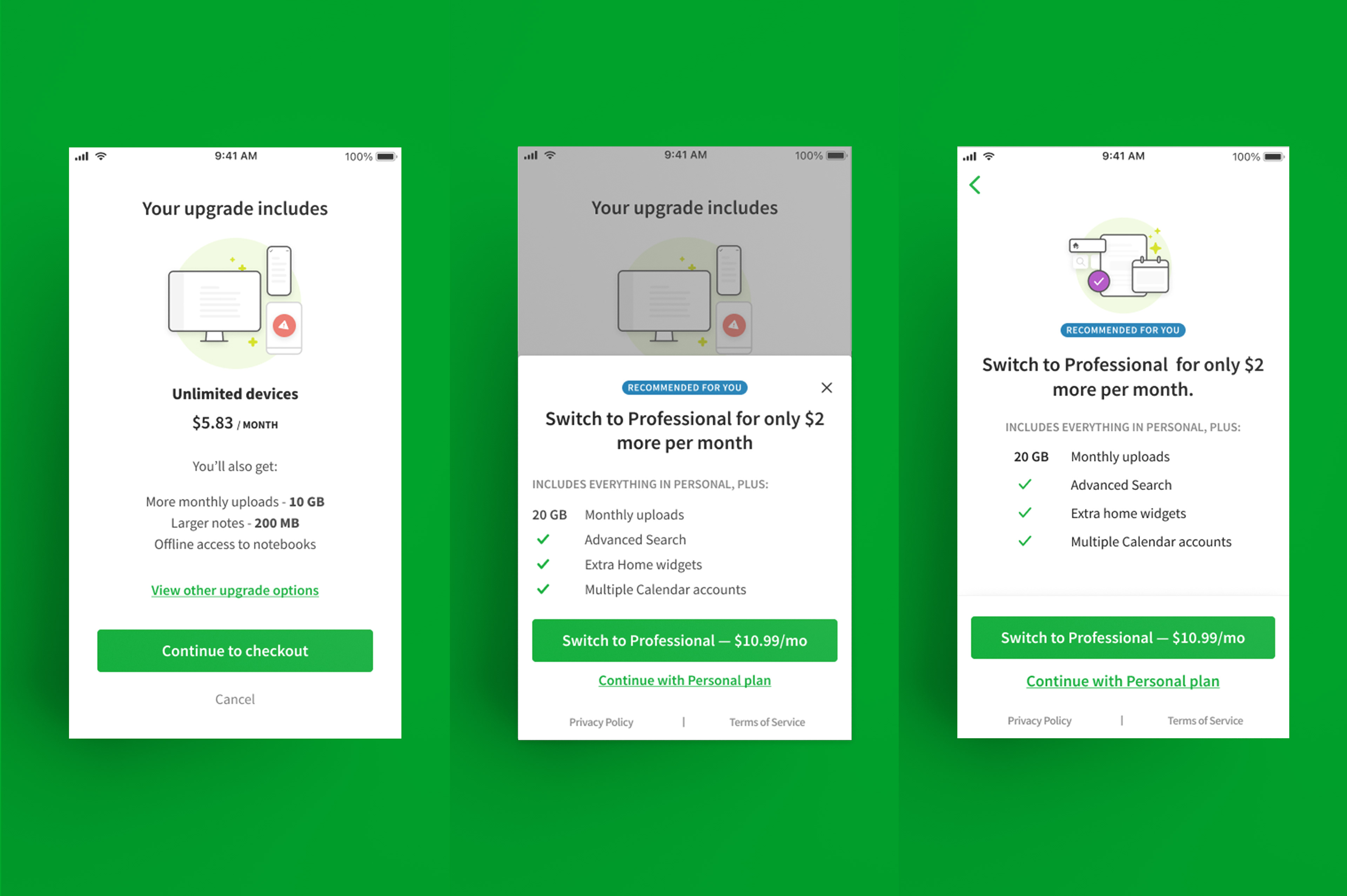
On the mobile client, a similar approached was used, with two types of patterns tested (half-sheet and full-screen).
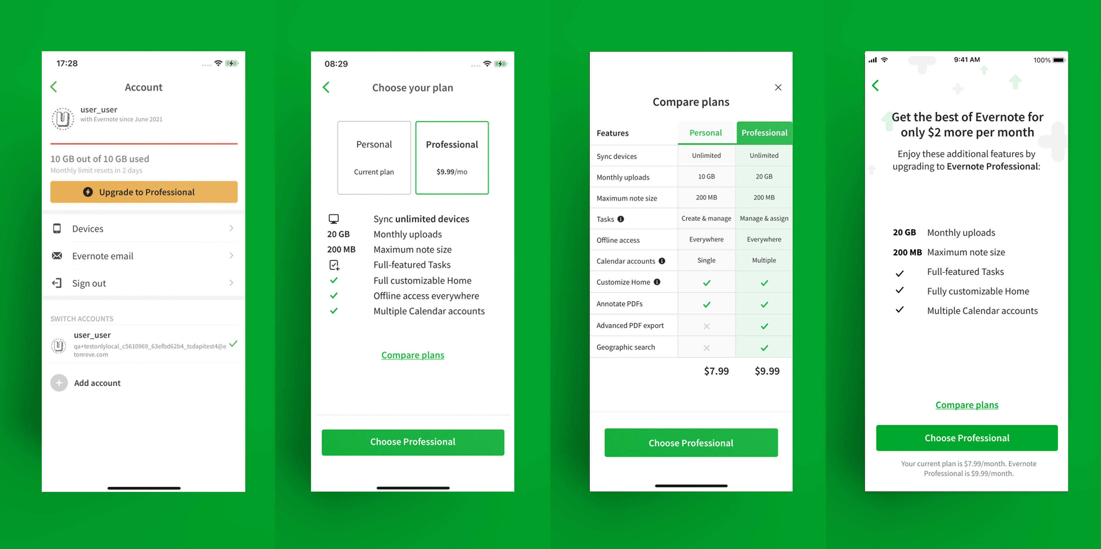
In a separate experiment, we tailored a similar message in a focused, full-screen experience (far right) as an alternative to a standard plan picker + comparison table, which required users to parse through much more information across two screens.