All new Evernote users begin their journey with a "Get Started" onboarding checklist, which contains a variety of feature walkthroughs, tutorials, or tips. The purpose of this checklist was to orient users with Evernote's capabilities, and educate them about how to leverage the product to achieve their own goals.
Aside from being a persistent place for new users to continue learning about the product, engagement with the checklist also correlated highly with many of our key retention and conversion metrics. This data helped the team confirm that experimenting and iterating on the checklist experience was a worthwhile stream of work.
However, user research showed that users were sometimes overwhelmed by how many items were in the checklist, and that it was too prominent on the home screen. With this knowledge, we set out to optimize the checklist component to deliver both a better UX and improve our key metrics.
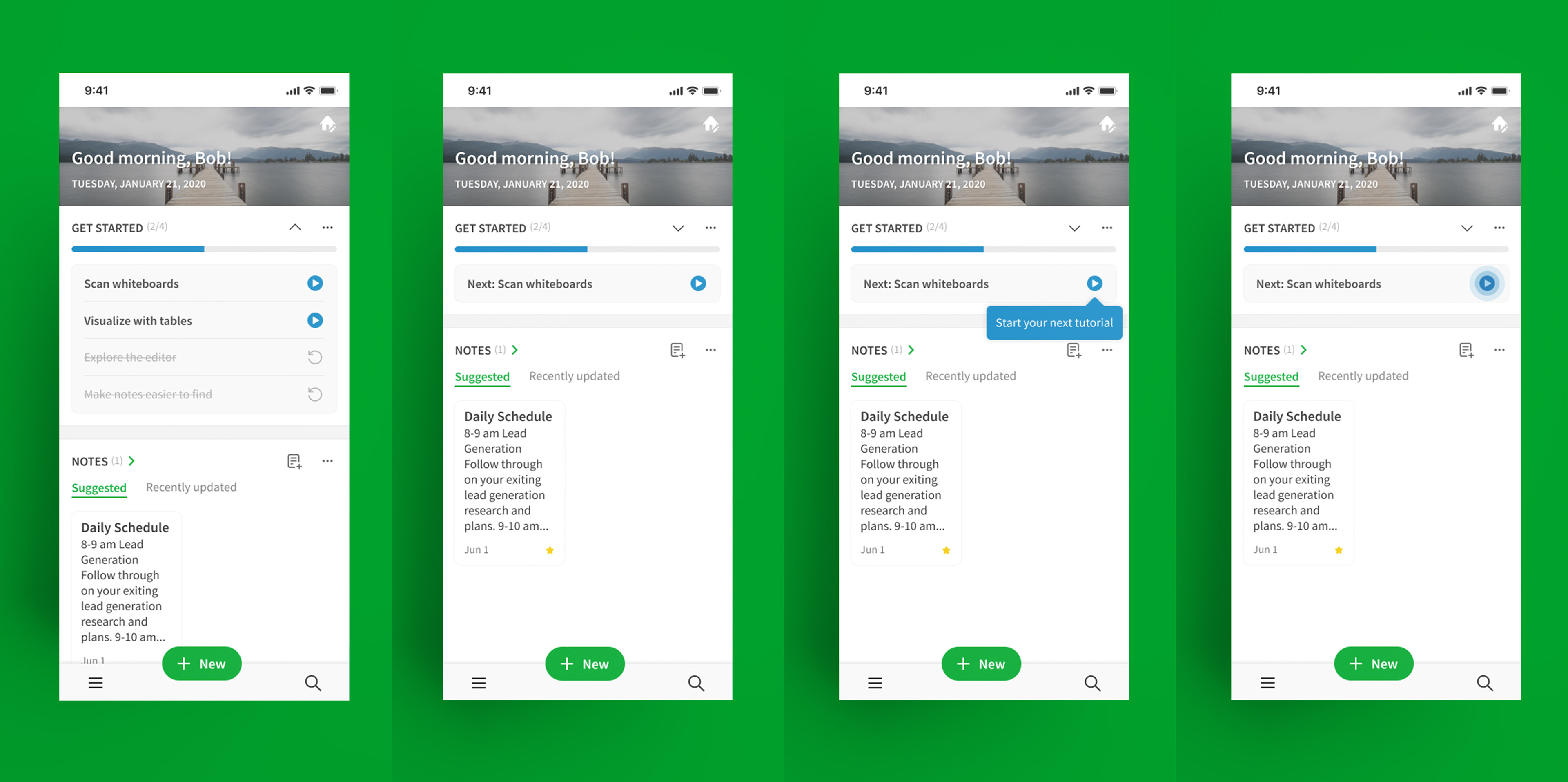
We started by introducing a truncated checklist experience with more actionable language, as well as a tooltip/orb prompting the user to engage with the next item.
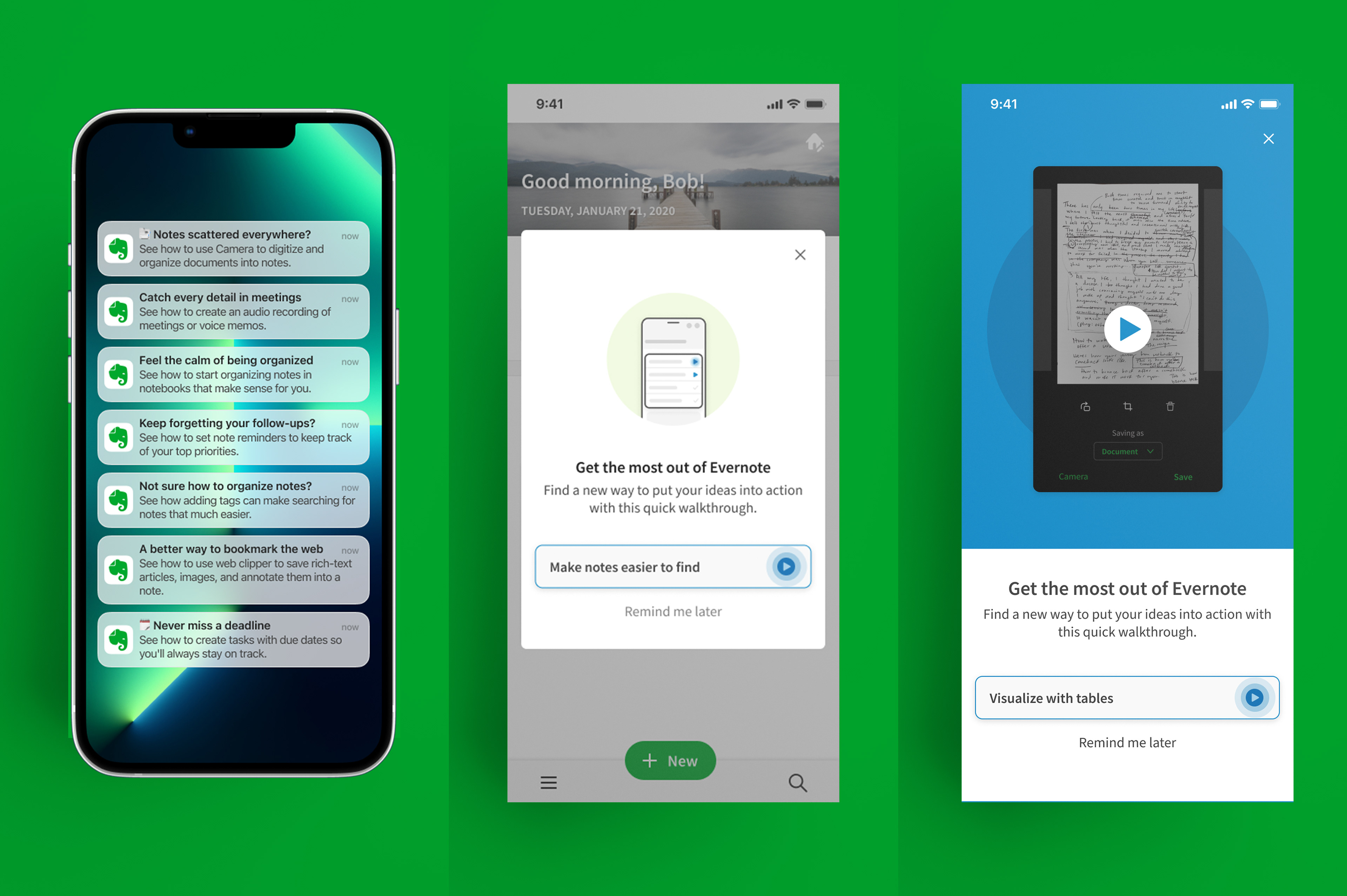
Subsequent areas of experimentation continued to encourage users to complete their next onboarding checklist item. Tactics included push notification reminders (left), and two types of in-app messages (center and right).
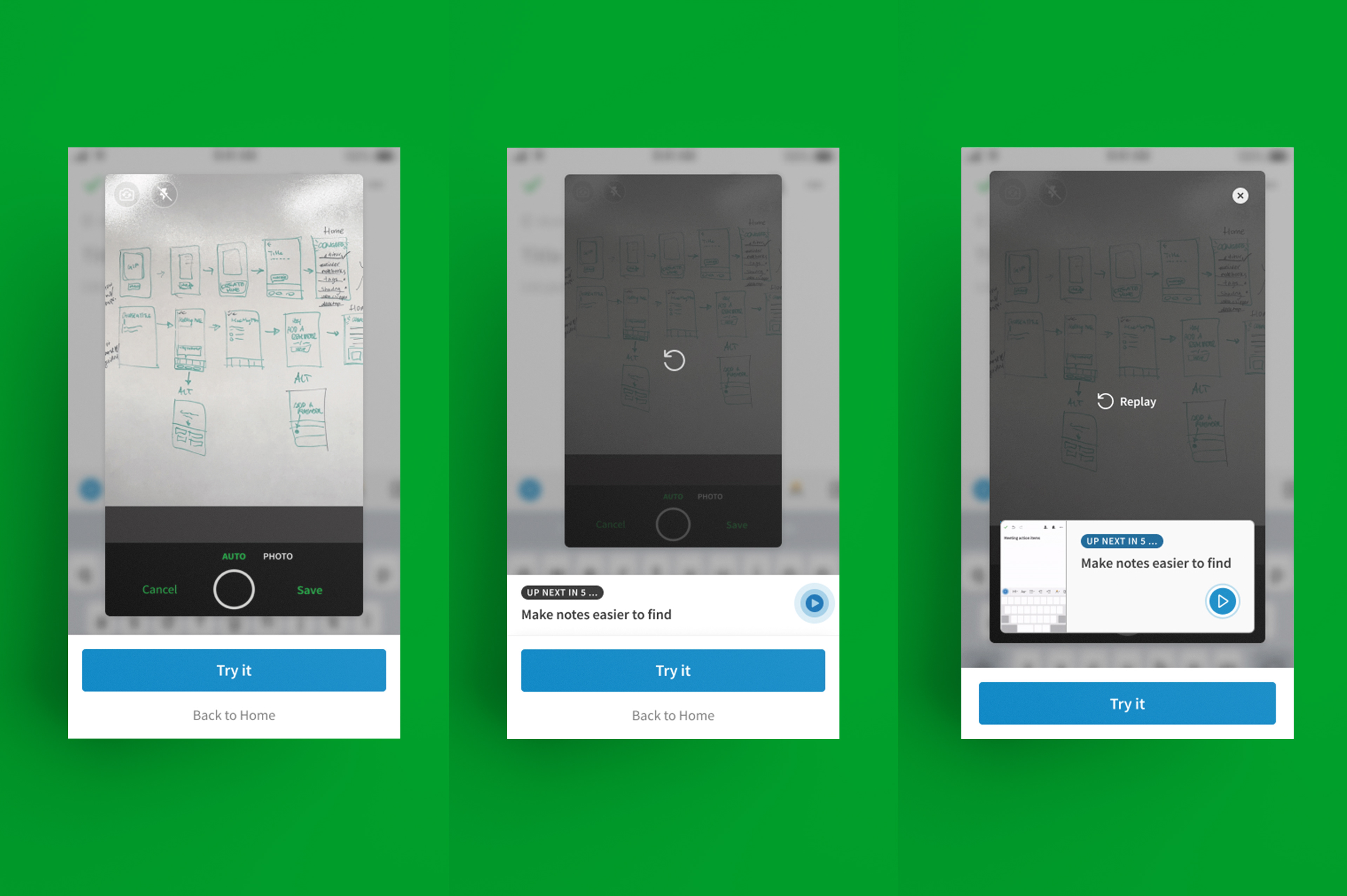
Many of the onboarding checklist items launched an animated walkthrough tutorial, so we also explored a continuous play experience that seamlessly advances users into their next tutorial automatically, with a countdown for transparency.